

Responsive design refers to creating websites that provide users with an optimal browsing experience regardless of the type of device they view a website from. Put simply, content on responsive websites renders according to the type of device that it is being viewed from. Several measurable benefits are achieved as a result of creating responsive websites and they will be discussed as this article continues.
A Brief History
The origin of responsive web design traces back to 2001 when the design technique was still a concept. Audi.com was the first website that was designed to adapt its layout to the width of the browser viewport. Terms such as “elastic”, “flexible”, “fluid” and “liquid” were thrown around during the early stages of responsive design. Ethan Marcotte then coined the phrase “responsive web design” in his 2010 essay. He then wrote a book on the subject the following year, titled “Responsive Web Design”.
Responsive design has come a long way since its inception in 2001. Though, there is still a significant number of websites out there that haven’t adopted this practice – 17% of websites, globally.
Definition
Here is how Google defines responsive web design:
“Responsive web design (RWD) is a setup where the server always sends the same HTML code to all devices and CSS is used to alter the rendering of the page on the device. Google’s algorithms should be able to automatically detect this setup if all Googlebot user agents are allowed to crawl the page and its assets (CSS, JavaScript, and images). Responsive design serves all devices with the same code that adjusts for screen size.”
Responsive vs Mobile-Friendly Web Design
The key difference between these two design techniques is how they function. Mobile-friendly sites are created with the intention of the entire website fitting on the screen no matter the device. The problem here is that the website appears the same way across all devices. This leads to a poor user experience i.e. the visitor has to constantly pinch and zoom to view different parts of the website
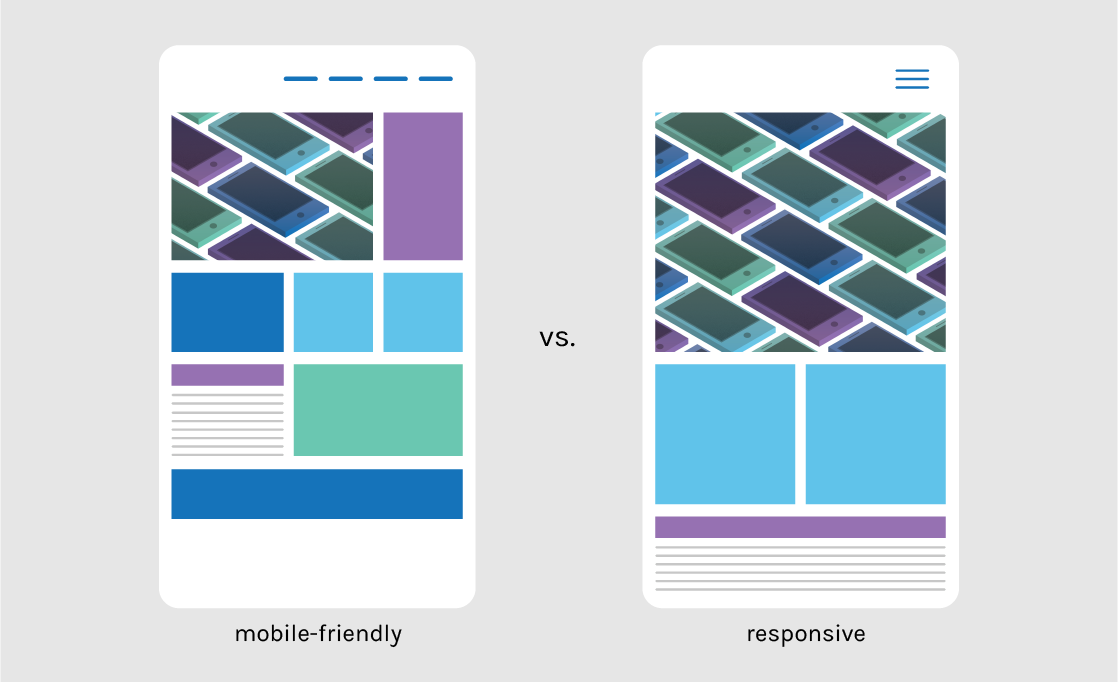
Responsive sites, on the other hand, enable a high-quality user experience across all devices by adjusting and rendering content according to screen size.
Why Responsive Web Design Matters
Responsive websites put user experience at the forefront of every visit. Just as with an offline business, a poor user web experience will do more harm than good. Below are some facts that highlight why having a responsive website matters.
In 2017, 52.64% of all global online traffic was from a mobile device.
This is a figure that increases year-on-year. In 2017, online mobile traffic was already higher than desktop. It is immediately clear that web designers and developers need to extend their focus beyond the user experience on desktop devices. The next point really backs this statement.
Mobile devices are projected to account for 79% of global online traffic by the end of 2018.
That’s almost 8 out of every 10 website visits. Therefore, creating a seamless experience across all devices is of the utmost importance. The next point explains why.
57% of users say they wouldn’t recommend a business with a poorly designed mobile website.
Here is where the importance of responsive web design really comes into play. It’s all about the user experience. Revisit the above image demonstrating the difference between a mobile-friendly and a responsive website. Imagine trying to navigate the mobile-friendly website, which requires you to pinch and zoom to make content legible. Would you recommend such a poor experience to a friend?
Almost 80% of customers say they would stop engaging with a website if the content displays poorly on their device.
This reaffirms the point made above. A website that requires visitors to pinch and zoom in order to view content is providing a poor user experience. Ultimately, that visitor will simply leave and not return in almost all cases.
Google states that 61% of users are unlikely to re-visit a website on mobile if they had trouble accessing it. Additionally, 40% of those users are likely to visit a competitor’s website.
This is a very important number for business owners to take notice of, as mobile share of traffic is projected to be almost 80% by the end of 2018. That’s a much larger number of customers turning to competitors than ever before.
The facts above demonstrate the importance of having a responsive website. Mobile traffic is increasing year-on-year and customers are becoming increasingly demanding. Ensuring a seamless website experience for your visitors is crucial.
Effects on SEO
“Search Engine Optimisation (SEO) is the process of affecting the online visibility of a website or web page in a web search engine’s unpaid results” – Wikipedia
Having a responsive website is a vital part of search engine optimisation, especially now that mobile traffic is more prominent than desktop traffic.
Google introduced the concept of mobile-first indexing in 2016 and officially launched it on March 26th, 2018. Essentially, Google established a separate index for mobile search results, as it understands that users care more about a high-quality experience on mobile. This means that search results will appear differently on mobile and desktop.
If you search for a product on Google, you will notice that responsive sites will mostly appear on the first page. Google gives these websites priority, particularly when the search is being conducted on mobile. In fact, Google will display if a page is not mobile-friendly in the search results.
The bottom line is that a website that’s not responsive is much less likely to appear first in search results than one that is.
If you want to find out a little more about SEO and what it is, read The Ultimate Guide to SEO in 2019 by Cardinal Digital Marketing.
Benefits of Responsive Web Design
You will become more visible in search engines
Google and other search engines give preference to mobile-friendly websites. Engaging in responsive design is the first step to making yourself more visible in search engines. Additionally, Google has rolled out mobile-first indexing, meaning a separate index exists for mobile search results.
In terms of SEO, Responsive Design enables you to focus all your efforts on one website. Backlinks and regularly publish high quality content both help improve your search engines rankings. A responsive site allows you to point all backlinks to one place instead of spreading “link juice” across multiple variations of your site. You will also use fewer resources to develop content with a responsive site, as all content will be published on one website.
Increased sales and conversion rates
A high-quality user experience will lead to higher engagement rates on your website. An enhanced user experience will lead to lower bounce rates, more page views and more time spent on your website. The end consequential result will be an increase in conversions and sales.
You will save resources on mobile development
Designing a responsive website takes less time than developing a stand-alone mobile website, which was the traditional approach until the widespread adoption of responsive design.
Conclusion
Responsive Web Design is the standard web design technique that businesses can’t afford to ignore should they wish to make the most of their online presence. A one-size-fits-all approach has been obsolete for a number of years, especially since 2017 when mobile traffic overtook desktop traffic on the web.


