
Premium Responsive Web Design Packages for Sydney-based businesses

For nearly two decades DesignQ has been offering responsive web design and development services.

Responsive websites are the necessary requirements when it comes to web design. Customers search for products and services from different devices online, and now it’s not enough to optimise the website only for the desktop. We incorporate responsiveness into all our web design for Sydney and worldwide businesses and make sure that the websites we create are optimised for mobile and that they load fast.

The technologies we use:

  • Static Websites
  • Dynamic Websites
  • Mobile-friendly Websites
  • Ecommerce Websites
  • WordPress Websites
  • Joomla Websites
  • Drupal Websites
  • Shopify Websites

How much does responsive web design cost in Sydney?

Creating a professional responsive website doesn’t have to cost an arm and a leg. We offer a range of web design packages. Our professional web design packages start at $1980!

Get the most of your website

Did you know that at DesignQ, you can get the whole branding or digital marketing strategy done for you? Get more value by combining our different packages and services. Bundle web design packages with our logo design, graphic design or digital marketing solutions and save even more!

Read Case Study
Web Design and Development

Importance of Responsive Web Design

Responsive Web Design practices ensure that your website renders consistently on a variety of devices and screen sizes. Devices such as desktops, laptops, mobile phones and tablets all have different resolutions. A seamlessly loading responsive website ensures higher engagement and increases conversion.

Google has officially stated that up to 60% of global search queries are conducted from a mobile device. Mobile search traffic for websites has been ahead of desktop traffic since 2015 and the disparity has become greater every year since. As a result, the user experience on mobile devices has become a focal point for web designers.

Search Engine Optimisation (SEO) has had a major impact on responsive web design. Responsive websites rank better on Google’s Search Engine Results Pages (SERPs) than their non-responsive counterparts. Google has introduced Mobile First Indexing. This means that the desktop and mobile versions of your website can rank differently on SERPs, especially if configured with only desktops in mind.

Principles of responsive web design

Responsive web design (RWD) is an approach to web design that prioritises the user’s experience across a wide range of devices. It is achieved by creating a flexible and adaptable layout that can automatically adjust to the device’s screen size and orientation. The principles of responsive web design include:

  • Fluid grids: Fluid grids are a crucial component of responsive design, as they allow content to adjust to different screen sizes and resolutions. By using percentages instead of fixed measurements like pixels, elements on a page can be scaled up or down, making the layout more adaptable.
  • Flexible images: Another essential principle of responsive design is using images that can adapt to different screen sizes. This can be achieved by using CSS to set the maximum width of an image to 100%, so it scales down without losing quality.
  • Media queries: Media queries allow you to define different styles for different devices. By specifying different rules for different screen sizes, you can ensure that your website looks great on any device.

Benefits of responsive web design

Responsive web design offers numerous benefits to website owners and users alike. Some of the most significant advantages include:

  • Increased accessibility: Responsive web design makes your website more accessible to users on all devices, regardless of screen size or orientation. This means that more people can access your content, leading to increased engagement and conversions.
  • Improved SEO: Google and other search engines prefer responsive websites, as they provide a better user experience. This can lead to improved search engine rankings and more traffic to your site.
  • Cost-effective: Responsive web design is a cost-effective solution to the problem of creating separate websites for different devices. By creating a single responsive site, you can reduce development costs and ensure that your website is future-proof.

Responsive Websites Have Higher Engagement

In 2017 mobile traffic accounted for 52.64% of total global online traffic. That figure is projected to reach 79% by the end of 2018. Here are some facts about responsive websites and engagement:

  • Approximately 57% of internet users have said that they would not recommend a business with a poorly designed website on mobile.
  • Almost 80% of customers have said that they would completely stop engaging with content that displays poorly on their device.
  • Google states that 61% of users who have trouble accessing a website are unlikely to return to it. Additionally, 40% of those users are likely to visit a competitor’s website.

How Responsive Web Design Works

Here’s what Google has to say:

“Responsive web design (RWD) is a setup where the server always sends the same HTML code to all devices and CSS is used to alter the rendering of the page on the device. Google’s algorithms should be able to automatically detect this setup if all Googlebot user agents are allowed to crawl the page and its assets (CSS, JavaScript, and images). Responsive design serves all devices with the same code that adjusts for screen size.”

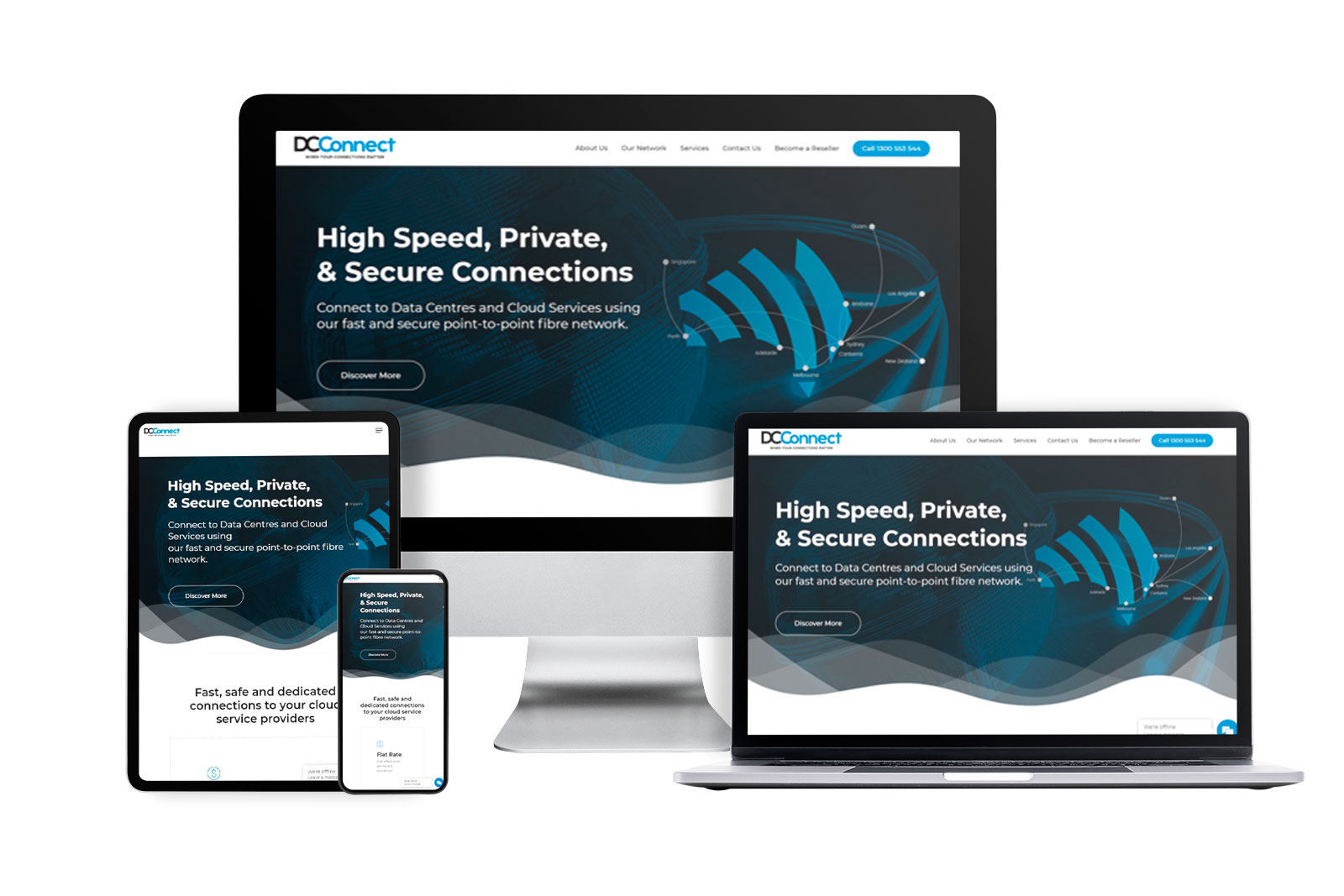
Responsive Web Design provides the best possible level of user experience across all devices. Importantly, responsive websites are different to mobile-friendly websites, which require pinching and zooming to view content.

FAQs

What is a responsive website?

Responsive websites are mobile-friendly websites that are created to provide the best user experience on different devices with an emphasis on mobile devices due to the increasing amount of Google searches that happen via mobile devices.

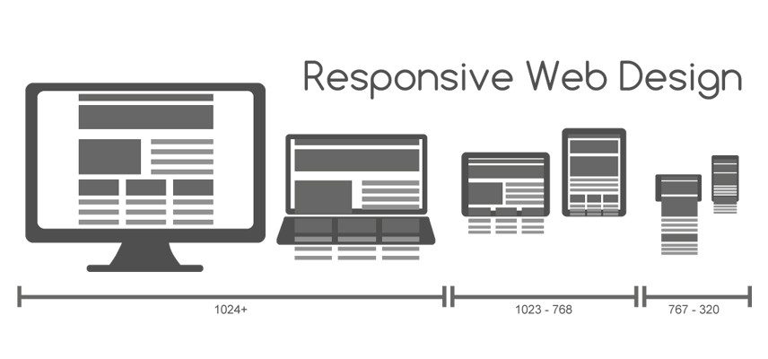
A responsive website automatically adjusts its layout and content to suit the screen size and orientation of the device being used.

Why are responsive websites important?

Responsive websites provide better user experience which is essential for conversion, sales, and user retention.

With the increasing popularity of mobile devices for browsing the internet, responsive websites ensure that users can access and interact with your website regardless of the device they are using. Responsive websites are also preferred by search engines, leading to improved search engine rankings and increased traffic to your site.

When to use responsive web design?

Responsive web design should be used when designing any website that needs to be accessible and user-friendly on multiple devices. This includes ecommerce sites, news sites, and any other site that wants to reach the broadest possible audience.

Responsive web design is also ideal for businesses that want to future-proof their website and ensure that it remains up-to-date as new devices are released.

How to implement responsive web design?

Implementing responsive web design involves using a combination of fluid grids, flexible images, and media queries to create a website that can adapt to different screen sizes and orientations.

This process can be time-consuming and requires knowledge of HTML, CSS, and JavaScript. However, DesignQ is here to help.

Are responsive websites expensive?

Not necessarily. We offer customised responsive website packages for businesses in different industries, large and small.

The cost of developing a responsive website can vary depending on the complexity of the project and the developer’s experience.

However, compared to developing separate websites for desktop and mobile devices, responsive web design is generally considered a cost-effective solution. In the long run, responsive websites can also save money by reducing the need for ongoing maintenance and updates on multiple sites.

View Portfolio

Why partner with DesignQ?

It's simple. Your success, is our success. At DesignQ we’ve been transforming businesses of all sizes through our solution-based approach for over 18 years.
Quick Turnaround
Needed your new website last week? Our projects can be turned around in as little as 1 working week!
Pixel Perfect Design
It's all about the attention to detail. We pride ourselves on delivering pixel perfect websites each and every time.
Unlimited Revisions*
We offer unlimited revisions* during the development stage to ensure you're happy with the outcome.
Professional Team
We take great pride in the quality of work we produce. Our team has helped hundreds of businesses like yours.

*Internal fair use policy applies

2000

Websites Launched!

100% satisfaction guaranteed

View Portfolio

Ready to get started?

Request a Callback

GET IN TOUCH


GET IN TOUCH


FREE WEBSITE AUDIT